
Before we started, I felt that my brand's image no longer reflected the true essence of Cat.Poupança — it lacked the closeness, authority, and professionalism that I wanted to convey to my audience. The entire process was smooth, organized, and focused on understanding what I really wanted to communicate. Not only did it meet my expectations, but it exceeded them with talent, dedication, and attention to detail. Today, I feel much more confident in presenting my brand and my work.

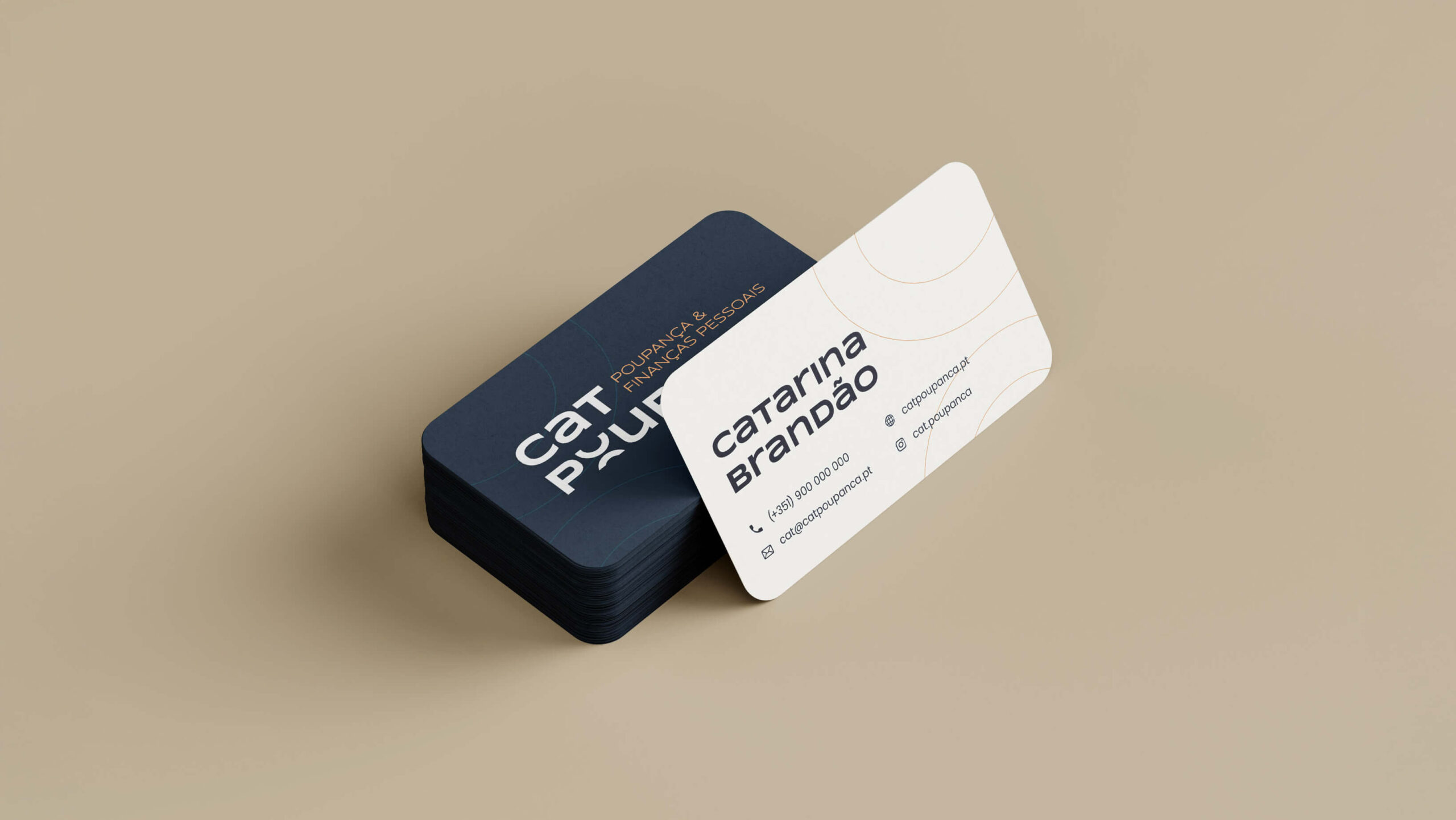
Catarina Brandão
@cat.poupanca